plume homepass ecommerce store
Plume HomePass had an existing e-commerce store that wasn't working hard enough. The visual design felt off-brand, the navigation was difficult to move through and the product display was cluttered enough to slow users down before they ever reached checkout. Plume needed the store migrated to Shopify and simplified in a way that actually converted.
the process
The core problem wasn't aesthetic. A cluttered store with too many products competing for attention creates decision fatigue, and decision fatigue kills conversions. The strategic direction was restraint: show fewer products at once, clean up the layout and give users a clearer path from browsing to buying. Shopify would give Plume the platform stability they needed.
I looked at how comparable e-commerce stores handled product display, navigation structure and checkout flow. The stores converting best were showing just the right amount. Simplified layouts with deliberate hierarchy outperformed dense, feature-heavy pages across the competitive set.
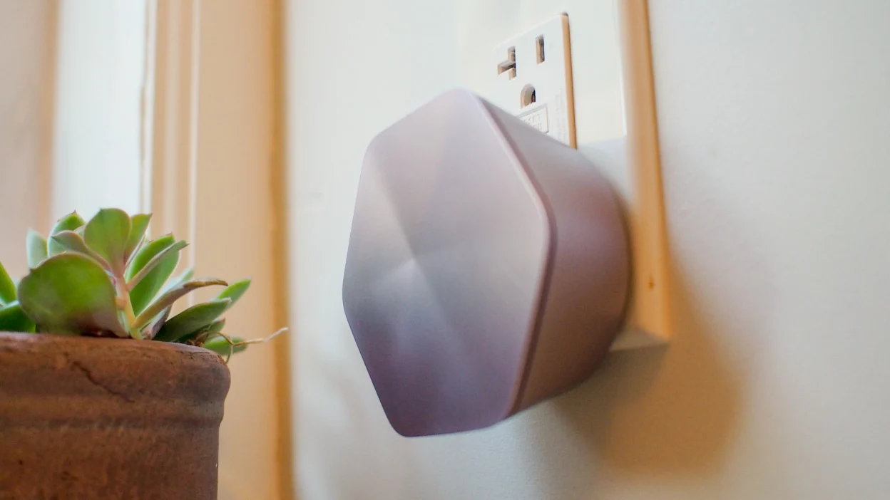
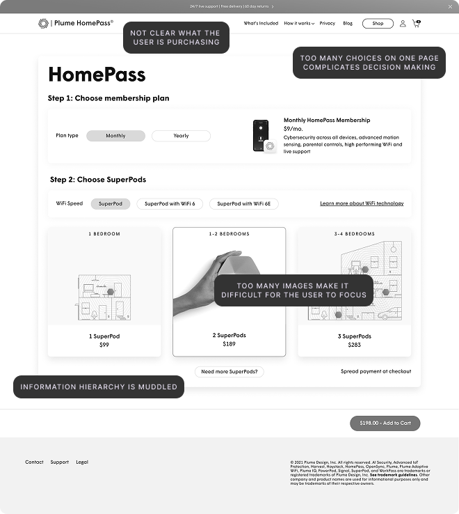
I created store wireframes that reduced visual noise. Fewer products surfaced at once, there was a cleaner category structure and I adjusted the layout to move users toward checkout. The before state showed a page asking users to do too much work to find what they needed.
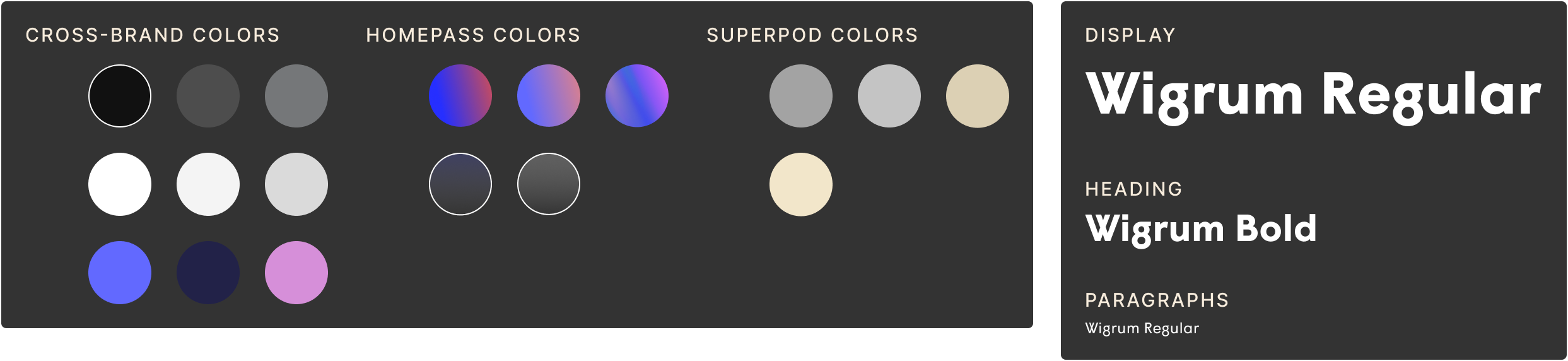
I extended Plume's existing design system to build out the redesigned store in Figma, adding components as needed to support the Shopify environment and the simplified product display. The prototype was built to handoff fidelity: detailed enough that developers could build directly from the files without ambiguity.
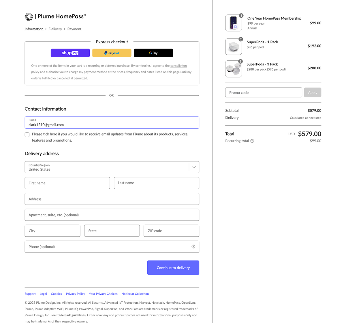
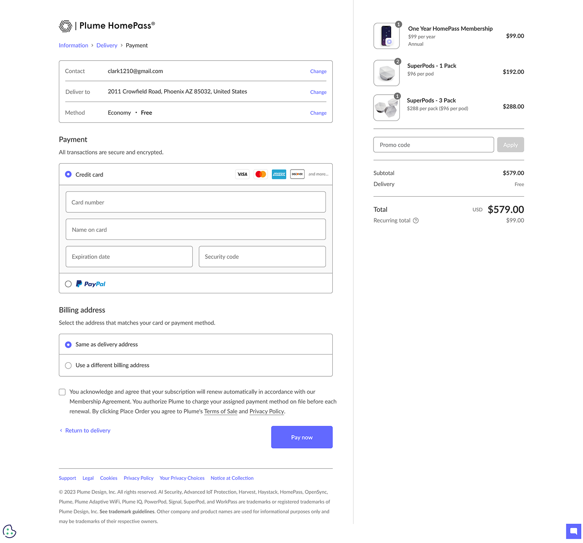
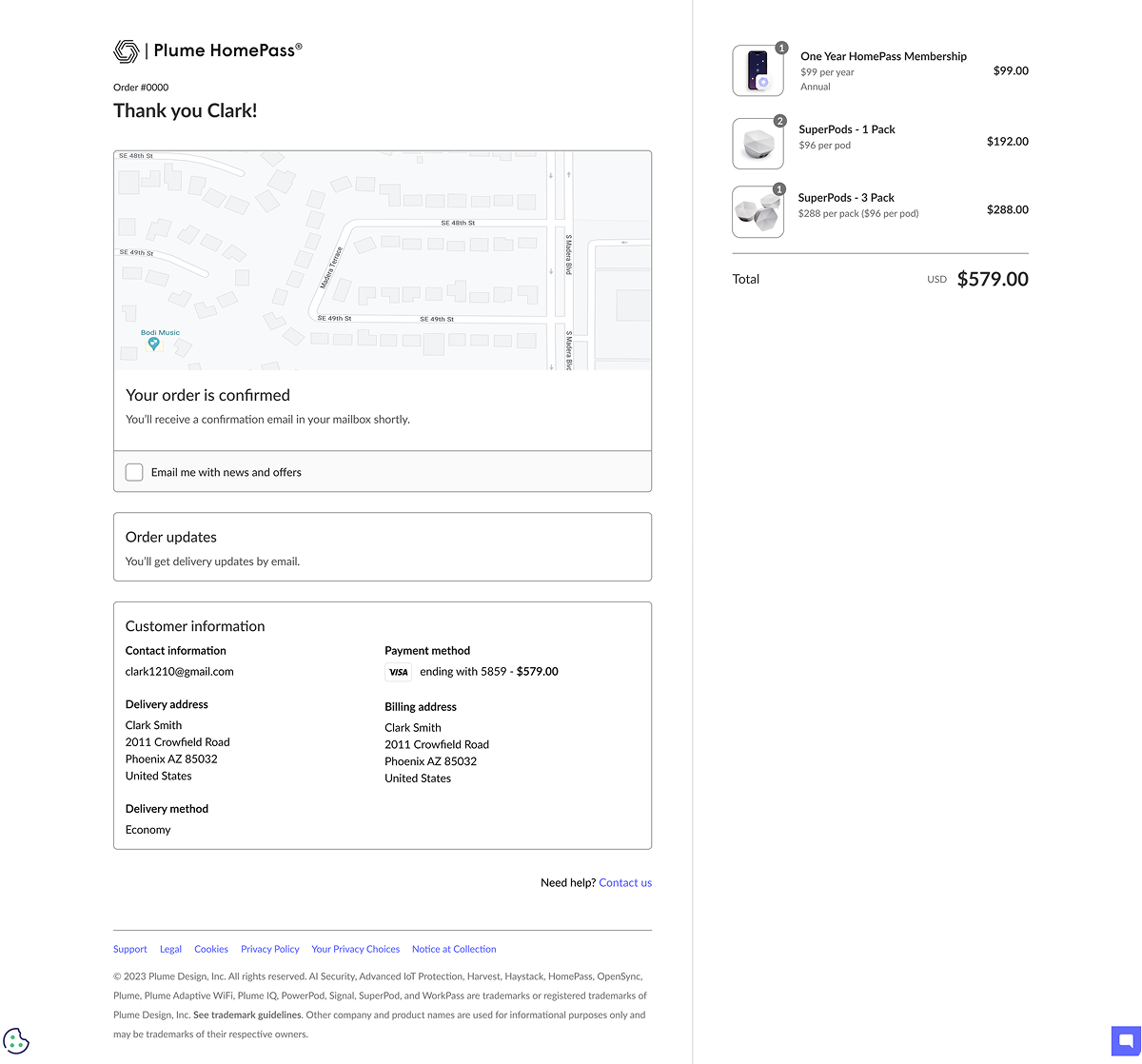
Plume's user research team tested the new store with real users before launch. Users moved through the store more fluidly and reached checkout with less friction. The feedback validated that restraint was the right direction.
I handed off Figma files directly to the development team, who built and deployed the store to Shopify. Conversion rates increased enough that Plume decided to roll the same design approach across their other brands, which I also designed.
before
after
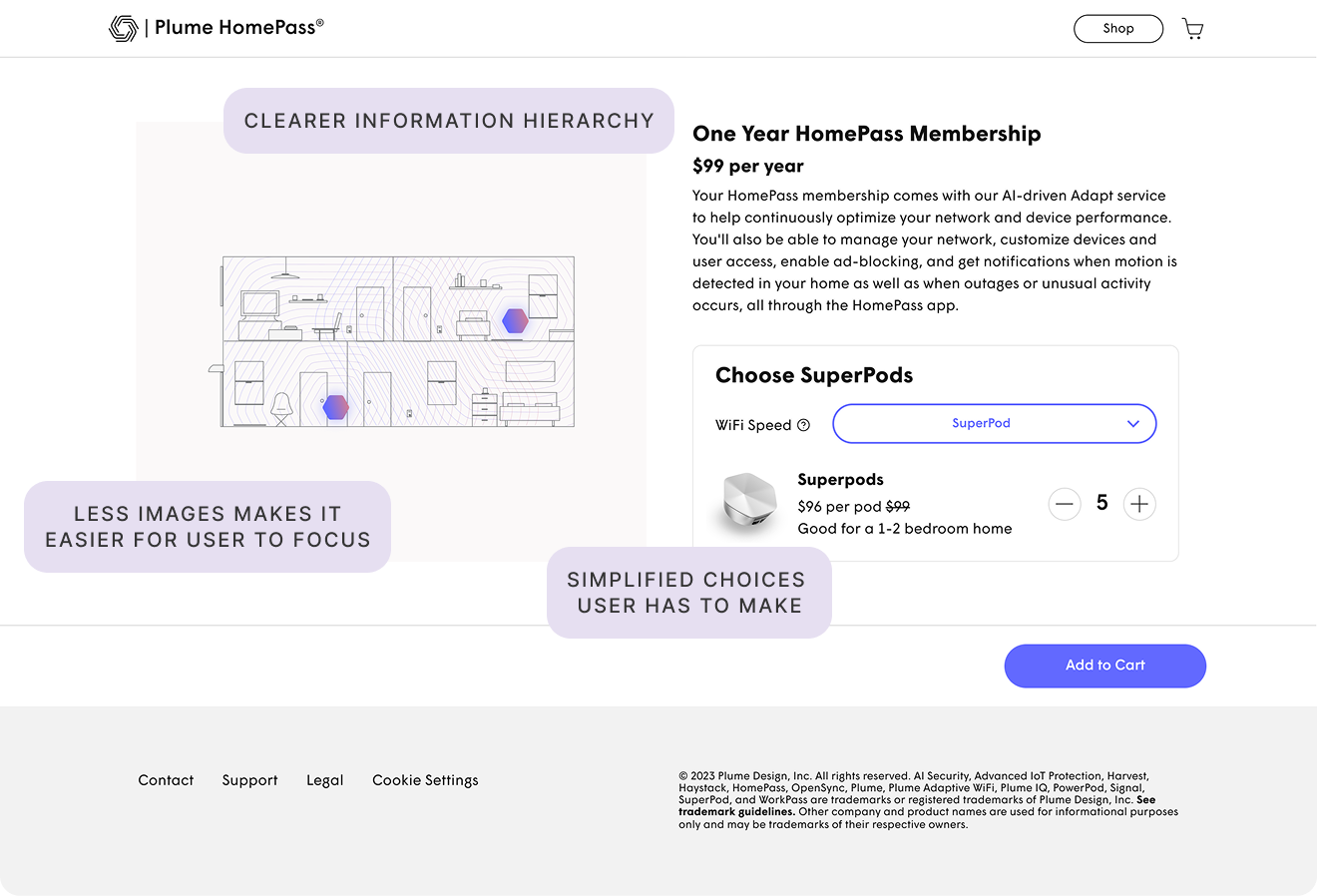
The instinct in e-commerce is often to show products, options and information. This project was a case for the opposite. Removing friction and reducing choices gave users a faster, clearer path. Sometimes the most effective decision is knowing what to take away.