plume homepass landing page
With the launch of Plume HomePass's newest product, the SuperPod G6, the landing page needed to do two things: introduce the new product and help users understand which SuperPod was right for them. Awareness alone wasn't enough. Users needed guidance to make a confident purchase.
the process
The existing landing page put the burden of comparison on the user. They had to browse the lineup, compare differences between products and decide. But for the SuperPod, the right choice depends on home size, internet speed and the user's number of IoT devices. The strategic direction was to shift from a passive display to active guidance.
competitive analysis


findings
I examined how competitors structured their product pages and how they handled comparison, decision support and purchase flow. Most relied on static spec tables that assumed users already knew what they were looking for. The opportunity for Plume was to meet users where they were: uncertain, comparing options, needing a recommendation rather than a data dump.
With the direction set, I created landing page wireframes. These led with the SuperPod G6 and integrated the configurator as the primary decisioning tool. The page structure moved users from awareness to action.
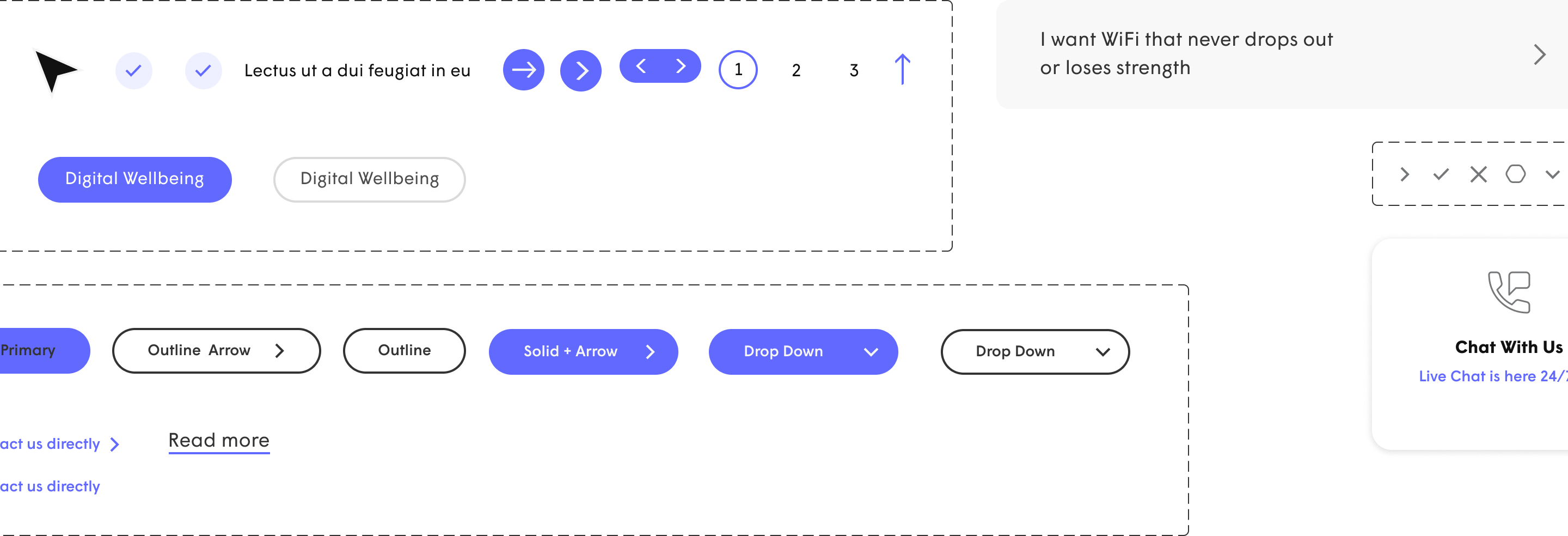
I extended Plume's existing design system while building out the new landing page with the configurator section. I added a few new components in Figma to support the new product.
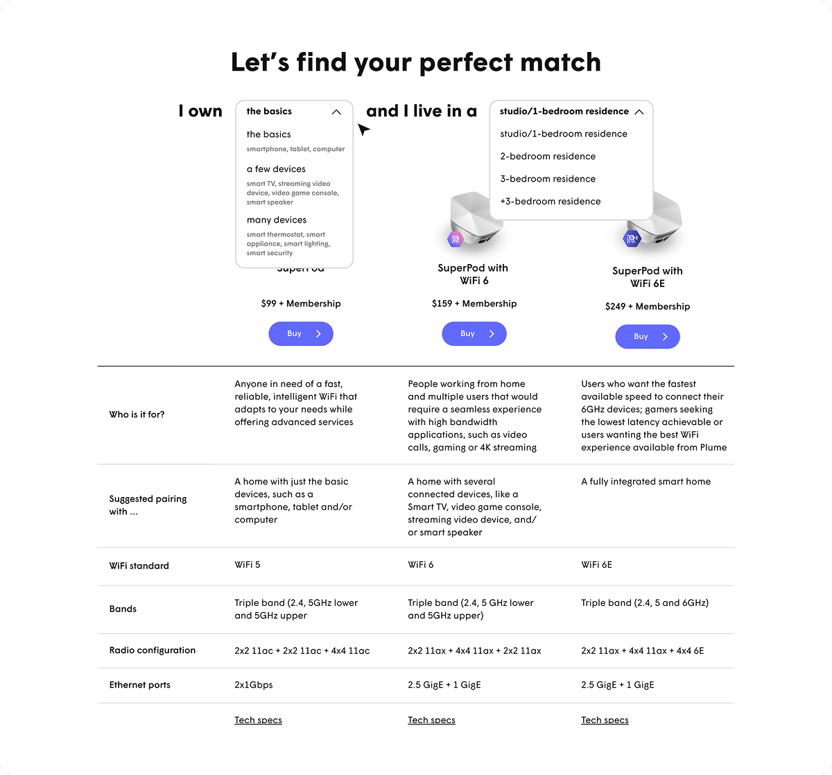
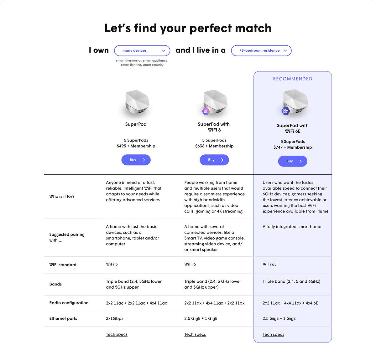
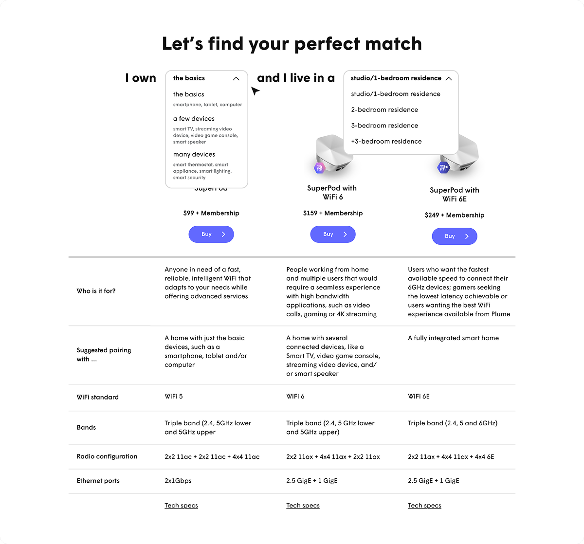
Plume's user research team ran A/B testing with real users, comparing the configurator experience against unassisted browsing. Users strongly preferred the guided approach; they were given a recommendation and no longer had to compare specs on their own. They moved through their decision faster and with more confidence. The data validated the core strategic bet: guidance over browsing.
I handed off the designs to the development team, talking through the prototype, clarifying interaction details and aligning on what would ship. The landing page launched with a modified configurator section—a common constraint of the development process. The guided recommendation approach remained the foundation of the final landing page.