john deere credit hub — guarantor
When a dealer adds a guarantor to a financing application, the analyst needs to select a guarantee type before making a credit decision. The existing interface had no way to handle it. I needed to add that capability without disrupting a dense, daily-use interface.
the process
Guarantors appear on Canada installment and lease applications only — a small percentage of cases, but a required step when they do. Analysts working the Involved Parties tab had no place to record the guarantee type and no path to a decision without it.
Three guarantee types needed to be selectable: Guarantee Already on File, Unlimited Guarantee and Limited Guarantee. The question was where and how to surface these options without adding friction to an already steady workflow.
I spoke with a credit analyst to understand how the guarantor workflow operated before designing anything. From there I explored four directions.
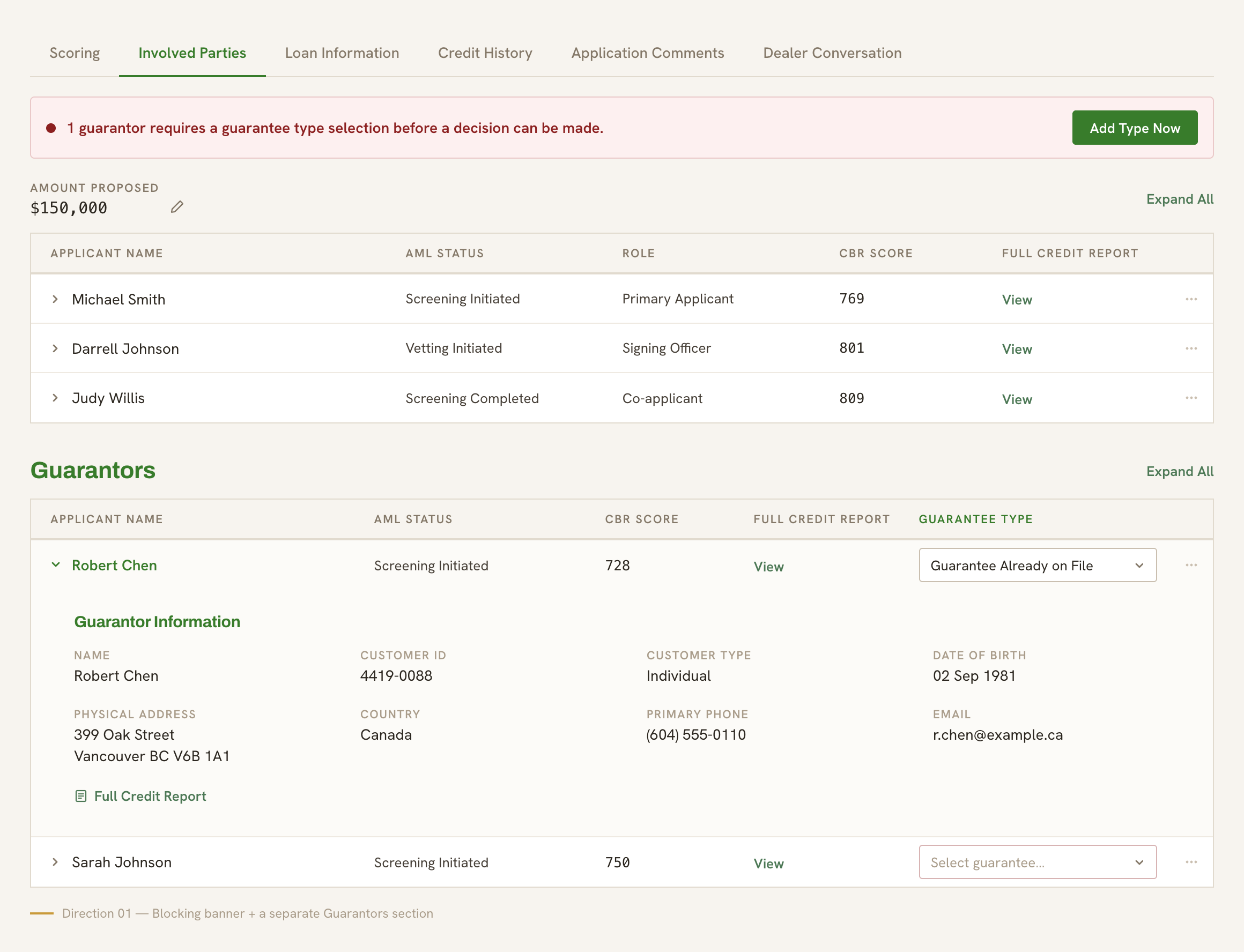
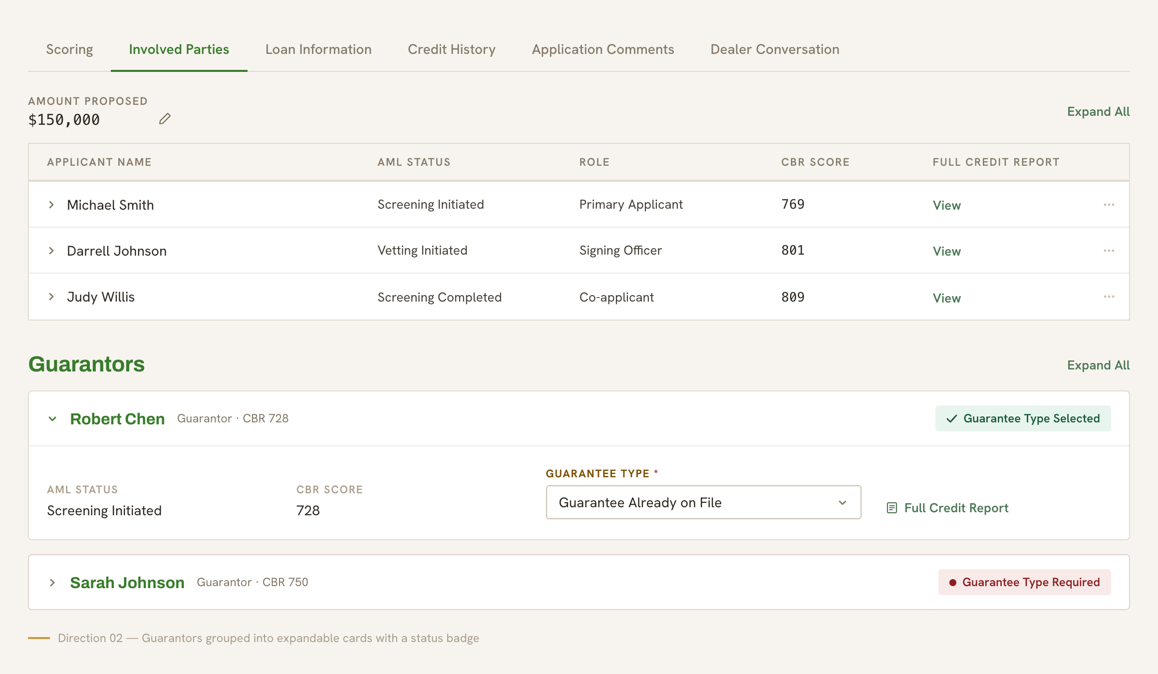
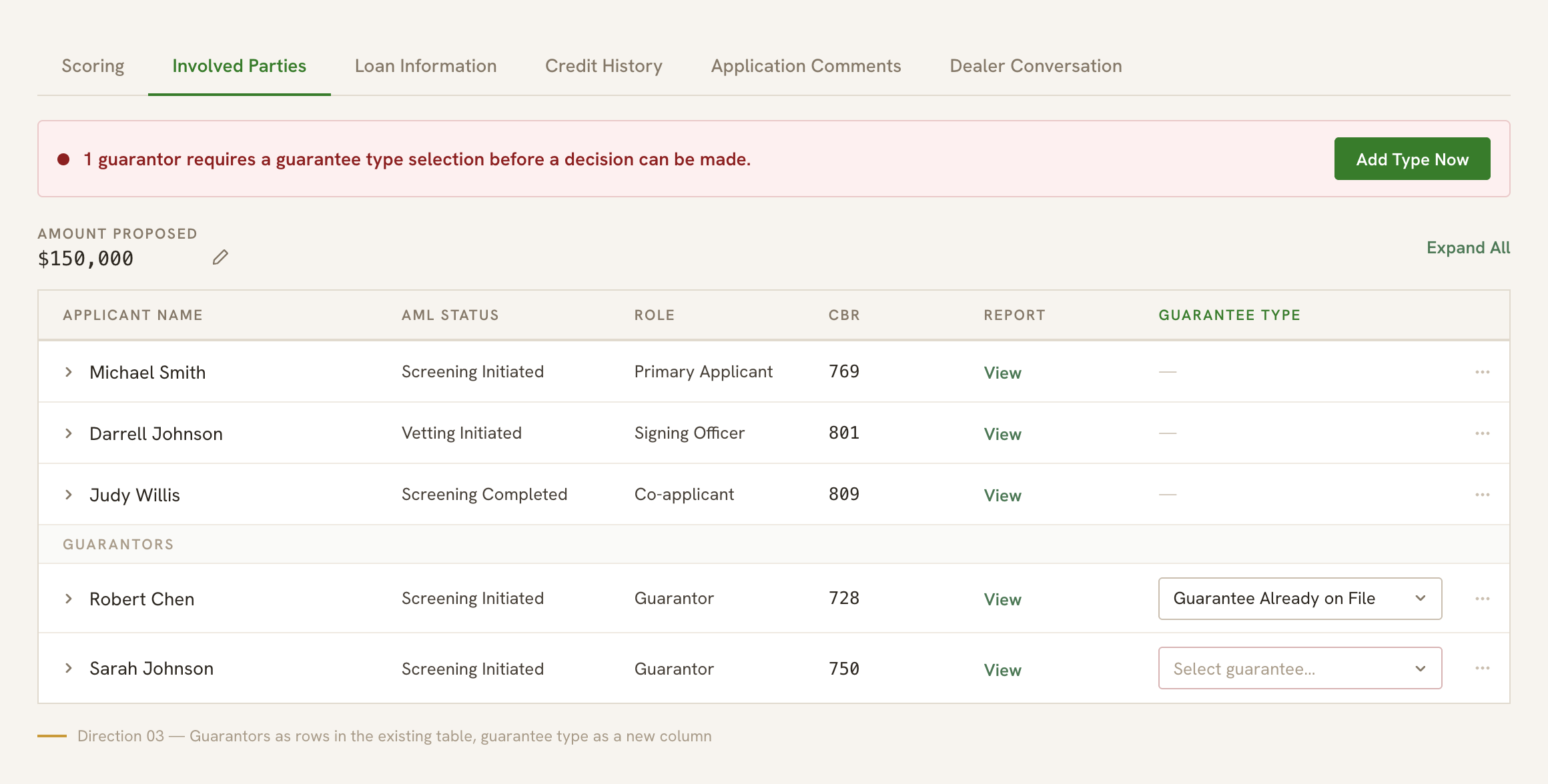
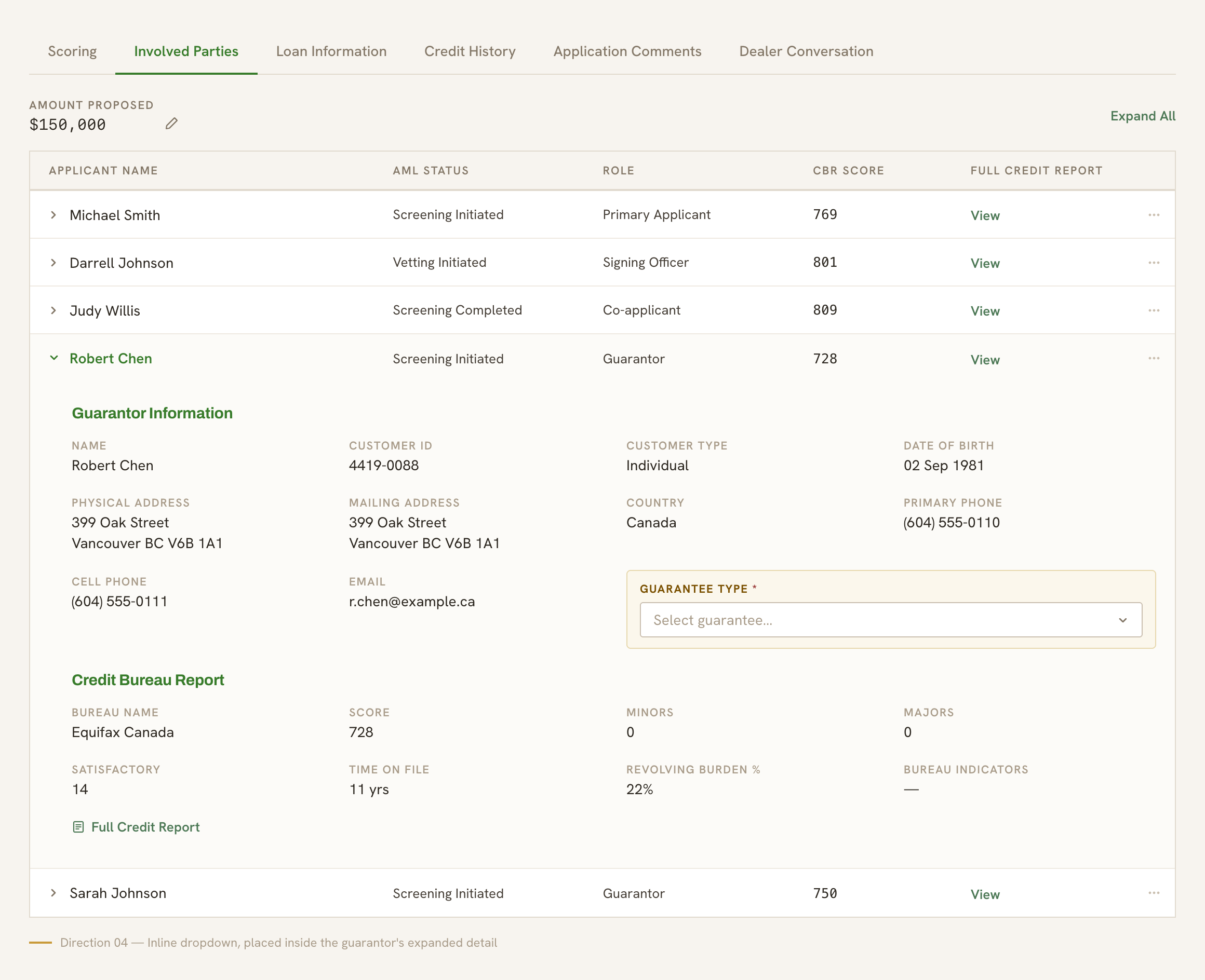
Each option solved the problem, but not equally. The banner and separate section added a new layer of navigation. The cards introduced a UI pattern that didn't exist elsewhere within the platform. The integrated row created visual ambiguity between applicants and guarantors. The inline dropdown required nothing new: no new section, patterns, nor relearning.
I recommended the inline dropdown. It kept the guarantee type selection in context, next to the guarantor it applied to, inside the table analysts were already using. I presented all four options to the PM with rationale for each. We both agreed the dropdown was the best solution.
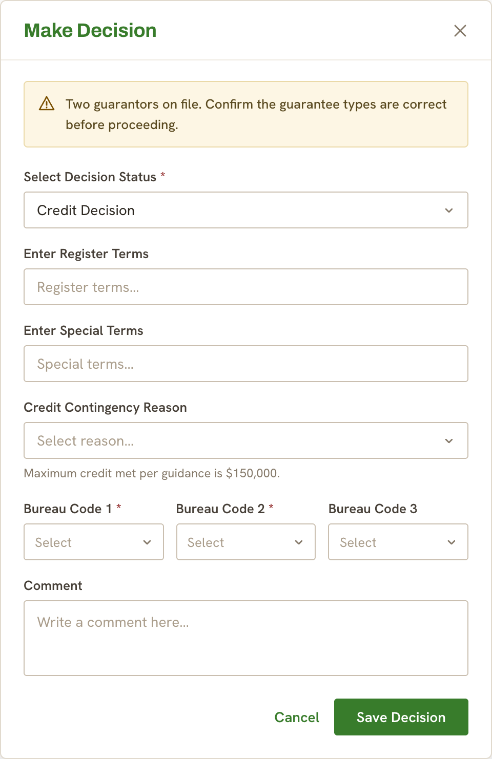
The final design included a validation state: if an analyst attempted a credit decision with a guarantor present but no guarantee type selected, the system surfaced a warning and blocked them from proceeding. With this addition, the feature shipped to production.
In a dense, daily-use interface, the solution that requires the least relearning serves the user most reliably. The dropdown won not because it was the most elegant option, but because it was the most respectful of the context it was entering.